I'll be posting (essentially) real-time updates as we journey through this process and sort out the good, bad & the ugly.
If you caught my last post, you know that we've been pre-approved (yay!) so we can make an offer at any time, and we're working with my mom as our realtor.
Before we dive in, here's some background info on our needs/wants. It's a little more challenging this time around because Brad and I have somewhat different wishlists.
These are the absolute must-haves we both agree on:
-A studio area for me (ie basement, loft, guest house, large room)
-At least 3 bedrooms
-At least 2 car garage
-At least 2000 sq ft (originally, but after seeing what's out there it's now more like 2500+ sq ft)
-A nice view
And here's the part we don't really see eye to eye on...
Brad's wish list:
-Bigger the better (ideally over 3000 sq ft)
-Space for a home theater room
-Newer construction
-Remodeled in a modern style (no updates needed)
-Acreage
Jenna's wish list:
-Nothing crazy huge (3000 sq ft is about my max)
-Cosmetically outdated but not a total fixer
-Amazing view—this is a deal breaker
-Character—I'm picturing an A-frame with lofted ceilings & wood beams
The biggest point of contention we have is the age/condition of the home. Of course I plan to renovate this place so I don't want to pay more for someone else's upgrades and feel bad when I tear them out, you know? At the same time I don't want it to be falling apart and have to deal with replacing structural or maintenance things like the AC, roof, windows, plumbing, etc. We'll have to come to some sort of compromise.
Now that you know what we're looking for, let's get this house hunting party started!
Here's some highlights from the houses we've seen over the past couple weeks. Photos were taken with my phone so you'll have to excuse the quality in some of them—we're just trying to get the general idea here.
House #1:
Great curb appeal. On a quiet street overlooking downtown.
View from the front door, with the living and dining room to the right:
Loved the two story foyer/living room.
The dining room had large windows with a great view and a ton of light:
The dining room had a door which stepped out onto the newly renovated patio (there was even a kitchen/tiki bar station just to the left, forgot to snap a pic!)
On the other side of the kitchen was a master bedroom and bathroom...
Heading back upstairs, you catch a glimpse of the living room again:
And walk into the loft:
On the other side of a loft is a hallway that leads into the other rooms,
First is a guest room:
Another bathroom:
And this huge bonus room:
One last look at the backyard from the second floor:
Verdict: Not for us.
If I was going to just move in somewhere and call it a day—no updates at all—this would be the house. It was so nicely upgraded and felt like a show house (even if the bad photos didn't convey it!) The size was perfect, the curb appeal was the best from all the houses we've seen, and the location was super convenient. Didn't have the view I was looking for though, and no privacy or land.
House #2
This one was just down the street from the first house. We immediately noticed the 1 car garage... uh oh.
Entry opens to an upper level living, dining and kitchen area.
It was well kept and there were a decent amount of upgrades.
The living room opened up to a large deck with a lovely view...
Back inside, we headed towards the front door to go downstairs (I believe there was a bedroom on the top floor, didn't get a photo)
The lower level opened to a huge master bedroom with it's own lower level deck:
I can't remember which was which, but here are the two bathrooms, pretty much carbon copies:
There were also a couple more rooms downstairs that didn't get photographed (just your basic carpeted white boxes).
Verdict: Not for us.
The single car garage was a deal breaker, but it was also on a somewhat busy/narrow street and really close to neighbors. The overall size and layout worked, but it was too updated for my liking and lacked the character I'm looking for.
House #3
Looks like your basic single story, but looks are deceiving...
Behind that blown out window, picture a jaw dropping mountain view...
And a sunken two story living room.
The kitchen and dining room are in the loft above the living space...
The layout is super weird. There's a bar inside the dining room and then a wall dividing the closed off small kitchen.
But then you go outside and take in this view and almost forget about the 70's time capsule inside...
Which can be enjoyed from one of the many decks...
Back inside there's a hallway with the master bedroom at the other end of the house :
And then you go downstairs...
And walk into this very long, narrow, strange "room"..
With two platforms. Why?
There was also this strange little gem... not big enough to be a room...
Of course there were some bathrooms and maybe another room that weren't photographed.
Verdict: Not for us.
Brad hated it—way too 70's for him. I was obsessed with the view and trying to think of all the remodeling possibilities to make it work for us. The room downstairs was weird and so narrow though and would have to be divided into my studio plus a man cave. But the neighborhood was absolutely perfect and we're keeping an eye out for more houses nearby.
House #4
This house is right in the heart of downtown.
Pretty nice curb appeal.
Great impression when you first walk in. There's a large sunken living room with wood beam ceilings and lots of windows.
Just to the right is a dining room...
But let's focus on the main attraction...
Loveeee this room. So much potential.
To the left is the kitchen/dining nook:
On the small side, but nicely upgraded and I like that it's open to the other rooms.
Looking back to the living room from the kitchen:
The kitchen walks out onto the first deck area, with a view of downtown:
The deck wraps around the side of the house:
Back in the foyer area is a hallway and a staircase leading to the master suite. Let's go there first.
This room is great. Huge, lots of windows and a lofted ceiling.
Nice view too:
The bathroom/master closet is very strange though...
They put a vanity inside of the closet... odd. Here's the bathroom side:
It's large enough to rip everything out and reconfigure though.
Let's go back down to the main floor...
On the main floor is another bedroom and a carpeted (bleh) bathroom, and laundry room. Pretty standard, no photos of this.
The lowest level is where you have to start getting creative.
It opens to this giant empty room with a furnace and windows/doors overlooking the lower deck.
On one end of the room is a guest suite (not pictured—bathroom and walk in closet to the right):
On the opposite end is another small room, some storage closets (including a wine cellar basement), and this unfinished space which is the point where I became completely overwhelmed...
Which brings me to our Verdict: A possibility
Brad is more into it than I am, but there are lots of qualities I love. I'm a huge fan of the living room and those wood ceilings. There's lots of potential. I love the master bedroom space. I like the outdoor living areas and the convenient location to downtown—we could walk everywhere. The view doesn't blow me away but I could live with it. There's more than enough room to grow (but that means more to clean, heat and cool). The amount of unfinished space might be more than I want to take on.
We're going to keep it on our list and see what else is out there first.
Last house of the day....
House #5
I present to you... one of the most unique houses I've ever stepped inside...
It's a straw bale house. As in, constructed using straw.
A peek inside the walls...
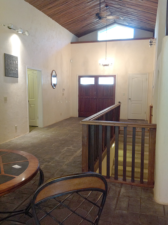
Walking into this house is like stepping back in time, somewhere in Europe...
The materials are just incredible, it's like your outdoors in some gothic alleyway...
I don't even know what to say... I'll let the photos speak for themselves.

There's a deck just outside the dining area:
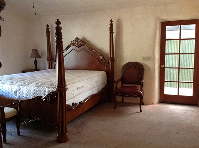
It felt like a movie set, very old world and romantic...
Master bathroom:
The huge glass window looks out onto a private deck...
There's also a guest bedroom, bathroom and laundry room upstairs.

Heading downstairs...
Another bedroom...
And an small random room...
Verdict: Awesome, but not for us
The main reason we veto'd this house right away is because it's in a neighborhood with absolutely no view at all. The house blew us away though. Clearly not our style, but somewhere I'd love to vacation to escape the 21st century. The right person will come along and fall in love with it, I'm sure of that.
Whew—well that's all I've got in me for today. We're going out again with my mom tomorrow—to a different town this time (on a lake!), so I'm excited to see some alternatives.
Homes in this area are really unique—not your standard cookie cutter subdivisions, so I'm always surprised each time I walk through the door. I hope you guys enjoy following along to see where we end up!


No comments:
Post a Comment