Showing posts with label tips. Show all posts

Tuesday, 19 November 2013

How My Design Style Has Changed & Figuring Out Your Own

A lot of my clients struggle because they don't know their design style. Or maybe they think they know but when it comes down to making decisions for their home they are all over the place. I've seen this struggle become a huge obstacle when it comes to decorating their homes.  I try to help most of my clients find out what it is they really love and I always remind them that figuring out your design style is not an overnight process. It has taken me years to get where I am at today.

To get a feel for my current design aesthetic take a look at a sampling of my Pinterest Living Room pins.


I find that I tend to gravitate towards lots of white and lots of color.


I love almost everything about this room. I'd probably add a little more color and some more graphic punches  but other than that this room is very  "me".

Now lest you think I've always been so design savvy please feast your eyes on our home 7 years ago when we were first married....


At the time I must say this was very "in" if you lived in Utah in 2005. I saved for months to buy that red and tan Pottery Barn Duvet cover and matching shams. That faux fern on the dresser was a T.J. Maxx find and I was obsessed with it. I also decided to put floating shelves a million feet up on the wall. I guess if I ever wanted to actually use that alarm clock I would need to stand up on my bed to reach it.

And then there was our Living Room.  I tried my best to mimic a Pottery Barn catalog. Do you think I succeeded?


Although part of me wants to look back on these pictures and cringe another part of me is proud of the home I created. I did the best I could with what I had and what I "thought" looked good. It has been fun, however, to see my style evolve over the years. 

The home I have now is SO different. Not only have I learned what it actually means to have style but I've really been able to discover what my own personal style is. 


There are a few key points I've figured out on this "design style journey" that have led me where I am today. This first point is,,

Let go of wanting it all // What I mean by this is, let go of wanting all the design styles in your home. For example, I love a lot of things about this room: 


But you will never see this room in my house. I  may take aspects of it, like the striped window bench and the striped rug and incorporate some of those elements in my home but I won't be mimicking this entire room. I have learned to look at this room, appreciate it and then let it go when it comes to my own home. Just because a style of design makes you excited doesn't mean it's a right fit for you or your home. 

Now this is not to say that you can't mix styles! Because of course you can. But thing carefully about the elements you are choosing to mix and make sure they are "you". 

The second point...

Stop buying stuff just because it's on sale //  I can't tell you how many clients I visit that have hoards and  hoards of things they have purchased because they were on sale or because someone gave it to them for free. These are the woman who spend way too much time browsing the home decor section of Target. (you know who you are). I am definitely one of these people! For example I really love this little gold accent table. I mean $59! I feel like that's too good to pass up. 


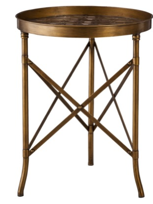
But I have absolutely no where to put it. I mean not one spot. And if I did put it anywhere it wouldn't really make sense in the spot it ends up. 

I feel like you are doing your house a disservice by filling it with things that you don't truly love or fit the style of your home. Most of the time we don't end up using much of what my client has collected.  So in the end your "sale" items were just a waste of money. If you can't think of place to put something or if it's not "perfect" for a certain spot chances are you won't end up using it. Save your money for the pieces that you really love and are "just perfect" for the spaces you end up putting them in. 

The last tip is to..

Start curating rooms you love and figure out what it is that you love about them. 


I've been obsessed with this bathroom from Sarah Richardson ever since I first saw it. I love the pops of dark pink, the white and accents of black. I love how it feels a little traditional but not too traditional. I can identify what I love about this room and carry it into my own home.

I am sure my design style will always be ever-chaning but at it's core I hope there will always be colorful and happy rooms involved! 

How have you figured out your design style? 

Wednesday, 31 July 2013

Easy Ways to Lighten a Dark Kitchen

I recently had a reader email me asking for tips on lighting up her dark kitchen.  She loves the look of white kitchens but unfortunately any major changes are not in their budget right now. 


As you can see the kitchen isn't horrible it's just really dark. The cabinets are clean and modern and the floor is at least light. 

If you don't have the means to give your kitchen a complete overhaul there are still a lot of easy changes you can do. 
1. I love the idea of using a beautiful tea towel as art. Something white with a little color will really brighten up the kitchen. 
2. If any of my clients ever have windows in the kitchen I always recommend installing a roman shade. A window treatment is a great way to add some pattern and color to the space distracting the eye from all the brown going on. Since this kitchen has all warm tones I chose a blue fabric to add a cooler feel to the space. Roman shades can be pricey so if you want to save some money you can make a faux roman shade using this tutorial
3. The easiest thing to do to lighten up the space is to add as many white accessories as possible. White will help to break up the brown. White serving pieces could also be added to top the kitchen cabinets.
4. I think adding crystal knobs to all the cabinets would be amazing.  
5. These canisters are bright and cheery and would really help bring the kitchen to life. 
6. I have patterned bowls displayed in my kitchen and I love them!
7. Because the kitchen appliances are all dark it would be great to brighten the oven up with a fun dishtowel
8. Although the client doesn't want to do any painting I'm going to strongly recommend painting the tile backsplash. I love this tutorial. I really feel like transforming the backsplash will help break up the darkness of the cabinets and countertops. 

What would you do to lighten up this dark kitchen? 

Tuesday, 11 June 2013

Tips for Building a New Home on a Small Budget

I've received some reader emails about what to spend their money on when building a new house. Most of us stretch financially to get into our homes in the first place and we don't have a lot left over for upgrades. We saved for four years to buy our townhome and when we went to the design center to choose finishes and upgrades we realized we didn't have a lot left over for all the "extras".  I had really been looking forward to choosing fun options for our new house but when we showed up I realized the options in our budget weren't the options I had been dreaming of.

SAVE //  I, like many many others, really love white kitchens. I set my heart on something like this:


image via House Beautiful 

However when we went to choose our cabinets I learned white cabinets would be an extra $3,000... gulp. Not in the budget. So we went with brown instead. They were a $0 upgrade.


I chose a modern shaker style that I really like. Because I couldn't have the color I wanted I decided to choose the shape and style I wanted. We can always paint later. I also wanted a beautiful marble countertop but had to settle for white laminate instead. That was another $0 upgrade. 

We also decided to opt out on a backsplash and did it ourselves a couple of years later. 

SPLURGE // We decided to go with hardwood (fake hardwood) floors on our main floor instead of the standard tile. I'm really glad we did this because re-flooring would have been a major pain later on. I am not going to lie though, the dark hardwood shows everything!

The paint color used throughout most of my home is Benjamin Moore's Hazy Skies


SAVE //  We had our whole house painted white. We saved a lot by doing one tone instead of two. I figured I'd rather paint walls than ceilings, baseboards and doors.  We later decided on a paint color for the walls but painting our entire house by ourselves was torture. I wish we had paid to just have it done but it saved us a lot of money. I also didn't want to just pick a color at the design center and cross my fingers that it worked out. I wanted to live in my house for a few months and really make the right decision on paint.

 image by Jessica Kettle Photography

SPLURGE // This may seem utterly ridiculous but we upgraded all our doors for $200. At first my husband thought I was crazy that I was so insistent on it but I'm so glad we did it. I love the modern look of the three panels and for some reason it makes my whole home feel more custom. It fits the style of my home so well.  Changing your doors is not really something you are going to want to do later so I'm glad I made this decision upfront.

left image by Britta Anne Photography and right image by Jessica Kettle Photography 

SAVE // We decided against having our windows framed out and just did it a few years later ourselves. The above pictures are of the same window in Jett's room. Before we had our windows framed out I disguised our lack of framing with high and wide curtains.


SPLURGE // The best decision we made was to vault our upstairs ceilings. This upgrade was a significant amount but so worth it in my opinion. The vault makes our teeny tiny rooms feel so much bigger. A ceiling vault is something you wouldn't be able to just add on later so it was a good investment upfront. 

SPLURGE // Anything behind the walls is always good to do upfront. We wired our downstairs basement for surround sound because it's something we'd never be able to do afterwards.

Overall just prioritize what things are most important to you. You will make mistakes but it will help you make better decisions when you go to build your next house!

What are the best or worst decisions you all have made in building your homes? 

Wednesday, 15 May 2013

How to Decorate Above Kitchen Cabinets


For some reason one of the questions I get asked most by my clients and my readers is, "What should I put above my Kitchen cabinets". My answer is typically, "nothing". I don't think this is the answer my clients are always looking for. Most of them can't imagine having so much blank space above their cabinets. In fact I think it's a little unnerving for people. But I actually like the negative space you create by leaving all that empty space above your cabinets. 


Plus I feel like you are able to focus more of your attention on all of the other details in a Kitchen instead of focusing on all the clutter! 


I feel like design is trending cleaner and cleaner these days. More people are craving clean and clutter free living spaces. 

image from this post

I honestly just don't see anything wrong with having nothing at all above your cabinets! 

However there are instances when a client can't bear the idea of not having once single knick-knack or decoration above their Kitchen cabinets and for those people here are some ideas... 


Stick to larger objects or the item will get totally lost and if you do want to use smaller objects group them together so they feel like one large statement piece instead of a bunch of smaller pieces. 

photo from this post

Keep the items minimal in shape and design. I love love love white ceramic pieces above cabinets because it gives you the chance to display objects but visually it doesn't appear to cluttered. 


via house beautiful 

If you are going to display something I think dishes make the most sense, it's a Kitchen after all! If you are going to display dishes make sure they are really beautiful. You can't go wrong with antique silver or pewter. 


domino

I like items to be similar in color so the eye isn't getting tired and going crazy with too much going on. Baskets in similar tones are a great idea! They are big enough that they can take up large amounts of space without creating too much clutter. 

photo via Me Oh My Photo by Ashlee Raubach

One of my favorite ideas is to take your backsplash all the way to the ceiling. I love the look of subway tile on an entire wall. This way you get a little texture and sheen but you don't have to actually put anything above your cabinets. 

If the idea of going totally "bare" above your cabinets is a little daunting start slowly... remove all the items and then just put a few things up that you really love. Or if you are brave enough try living with it empty for a few weeks and see if you can get used to it. 

No matter what don't add faux ivy... please. 

What are your tips for decorating above your cabinets! I'd love to get more ideas. 

Thursday, 14 February 2013

Top Tips for Decorating Kids' Rooms & Studio 5


Today I went on Studio 5 to talk about my top three tips for decorating kids' rooms. You can view the clip above to see my tips or you can read this post go get all the tips I talked about on the show!

 I LOVE decorating kids spaces because I am a pattern and color fantastic and so I feel like kids' spaces are where I can really let go and go crazy! 

I see so many kids' rooms done wrong and it makes me sad because kids spend so much time in their rooms. They should be such happy places for them to be. I wanted to offer some of my top tips for decorating kid's rooms that I'll be talking about on the show.  

TIP 1 // STAY AWAY FROM A THEME

I don't doubt that your child has a certain fascination with a character, movie or other type of theme but that doesn't mean their room has to scream, "Star Wars!", "Toy Story!", "Princesses" etc. We all know that kids lose interest in things quickly which is why I say, Stay away from a theme. They might be into it at the moment but what happens a year later when they could care less about monkeys. Now their new favorite animal is tigers. But that doesn't mean you can't incorporate things they love.

For example say your little boy LOVES airplanes.


You maybe tempted to do something like the above picture. This room is fine but its lacking any sort of "wow-factor" and  since it's all the same color and the exact same graphics on everything the room becomes very one note and flat. 

Now let's take this room as an example:


You get the overall feel that these kids love airplanes but it's much more interesting than the previous room. It also has more of a "fun" element to it. 


You can also take Jett's room as an example. My husband is a pilot so I wanted to have some sort of airplane theme in Jett's room but I didn't want it to be too obvious or over done. So I had my husband take some pictures out of the cockpit while he was flying and we framed them.  I also have a couple of airplane figurines. Doing a theme in small doses is the way to do it.


TIP 2 // STICK WITH SOPHISTICATED PIECES AND COLOR SCHEMES

When picking furniture and bedding for your baby or child think about pieces they can have for a long time. A typical changing table will really only be used until they get to big to lift up on it. Think about getting a dresser instead. A rug with little yellow duckies might be cute until they are 4 and then you are going to wish you'd bought something a little more versatile.  For Jane's Nursery I picked simple bedding, sophisticated furniture that can easily work in any room in my home and colors that can grow with her. 

There is nothing in her room that is too "childish". Obviously you don't want a nursery to feel too formal or sophisticated. Her room is still sweet and fit for a baby girl but if you took out the crib it could easily transform into a toddler room and even a teen girls room.


Just like your child is going to quickly grow out of a theme they are also going to most likely grow out of baby pink and baby blue. While these are fun for a nursery a year later you are going to be wanting something different. For Jane's Nursery I wanted to go with pink but I didn't want pink to overwhelm the room.  Also try and stick with a color scheme that doesn't scream "baby". Keep in mind they will  only be babies for so long. Ask yourself if you are still going to want baby pink and baby blue when your baby becomes a toddler. It's fine to use pastels but punch it up with some more saturated colors as well.


TIP 3 // HAVE FUN!! 

I love doing kids spaces because you can get away with things you wouldn't do in any other room. You can especially go a little crazier with color and pattern.

photo taken by me of Sawyers Room

 Don't be afraid to use wallpaper or paint the walls a fun color. 

picture taken by Chelsey Bell of This Nursery 

I loved designing this Nursery that is vibrant and full of life. I love that my client was brave enough to go with lime green on the walls of her son's nursery. And along with having fun I would say find ways to add a touch of whimsy. Children's rooms should be special and magical. Think of cute products you can add to the room that just bring a smile to your child's face. 


picture via Family Living

Add something unexpected. A child's room is a great place to add a giant stuffed animal, fun things hanging down from the ceiling, a swing! When you are designing a kids space try and connect to your inner child. What would you have wanted in your room when you were little? And do that! 

Your children are only children for such a short time. Make their rooms as special as you can so they are places where your kids can create lots and lots of happy memories. 

Want to check out my past Studio 5 appearances? 

Learn about curtains here. See my favorite winter decor items here. I rounded up my favorite sources for artwork here. Learn how to mix prints and patterns here. Get the courage to take risks in your home here. Watch my first segment on mixing up your furniture here

Tuesday, 30 October 2012

Tips For Designing Bookshelves

As you might remember my family had new family pictures taken in July by Justin Hackworth. My parents got our family picture framed and put above their mantel. Once it was up there they started to realize how outdated their current bookshelf decor was.

Here is a picture of their mantle and built-ins from a few weeks ago.


They had a lot of really random things on the shelves. 


I think they had just put stuff up just to fill spaces but there was really no rhyme or reason to how it was designed. 


And yes, that is faux Ivy you see up there. (gasp!) 


Just a bunch of "stuff": random jar of potpourri, a bust of Abraham Lincoln, a large jar covering up something else? Like I said no rhyme or reason to the design. 

My Dad enlisted my help to freshen the shelves up so I got to work! 

I was given a budget of $300 to fill the shelves back up. 

Here is the after:


I kept repeating the mantra "less is more" as I redesigned the shelves. I pulled off almost every knick-knack and tchotchke off the shelves and only left what I really loved or would work well in the space. I also used a lot of white and creams to enable the items to "pop" more off the shelves. 

Almost all of the frames and accessories were purchased at Target. 


I love the Target frames with the large white mats. They really help keep pictures from just blending in with all that dark wood. 


I used green as a my main accent color. 


Notice that there isn't any clutter. When you have so many shelves it's easy for things to get easily lost. Especially the items that are up high. I kept everything simple and clean. 


Here are some of my tips when designing shelves.

1. Remember the mantra, less is more. If you don't love it then you don't need it. 

2. Don't buy random suveniors when you are on vacation. My mom had picked up seashells, mini terra-cotta warriors, wooden boats, wooden animals, ceramic sculptures and other tchotchkes from all her travels. While I don't think you need to totally ban all souvenir buying I would say think carefully about what you are buying. I think some of the best souvenirs are just beautifully framed photographs from your trips. 

3. Put bigger items up higher. Small items can get lost easily when you put them too high up. Move your smaller items to the lower shelves and your bigger items up high. 

4. Stay away from faux Ivy. No explanation needed. 

5. Pick accessories that "pop". My parents have dark cabinetry so I wanted to pick a lot of lighter items to create contrast and make the accessories noticeable. 

6. Leave negative space. Not every shelf needs a million things on it. Sometimes one single item stands much better on it's own. 

If your shelves are feeling cluttered to yourself a favor. Take everything off and start from scratch. A few new accessories can go along way!